Design System and UX Blog
Practical English guides for Tamil Design System components, Tamil UX, accessibility, public-service patterns, Figma learning, UX principles, and Selva Toi video lessons.
All Articles
182 of 182 articles
Accordion Component Guide
Accordion organizes related sections into expandable panels. Use it when users need progressive disclosure without leaving the page. This guide covers practical usage, anatomy, props, accessibility, responsive behavior, common mistakes, and release checks.
Alert Component Guide
Alert presents important status, guidance, or warning content inline. It should help users understand context without interrupting their task. This guide covers practical usage, anatomy, props, accessibility, responsive behavior, common mistakes, and release checks.
Alert Dialog Component Guide
Alert Dialog interrupts the user for high-risk confirmation. Use it for destructive or irreversible actions that need explicit choice. This guide covers practical usage, anatomy, props, accessibility, responsive behavior, common mistakes, and release checks.
Avatar Component Guide
Avatar represents a person, team, or entity with an image or fallback initials. It helps users recognize identity quickly. This guide covers practical usage, anatomy, props, accessibility, responsive behavior, common mistakes, and release checks.
Badge Component Guide
Badge is a compact label for status, category, count, or metadata. It should add context without becoming the main action. This guide covers practical usage, anatomy, props, accessibility, responsive behavior, common mistakes, and release checks.
Breadcrumb Component Guide
Breadcrumb shows the current page position in a hierarchy. It helps users move back to parent sections without losing context. This guide covers practical usage, anatomy, props, accessibility, responsive behavior, common mistakes, and release checks.
Button Component Guide
Button triggers actions, submits forms, or moves users forward. Tamil DS buttons use clear hierarchy, fixed states, and accessible focus behavior. This guide covers practical usage, anatomy, props, accessibility, responsive behavior, common mistakes, and release checks.
Calendar Component Guide
Calendar supports single-date, range, and localized date selection. Use it for appointment dates, leave ranges, and date-of-birth flows. This guide covers practical usage, anatomy, props, accessibility, responsive behavior, common mistakes, and release checks.
Card Component Guide
Card groups related content and actions into a contained surface. Use it for repeated objects, summaries, and focused content blocks. This guide covers practical usage, anatomy, props, accessibility, responsive behavior, common mistakes, and release checks.
Carousel Component Guide
Carousel lets users browse a horizontal sequence of related panels. Use it carefully for optional content, not critical tasks. This guide covers practical usage, anatomy, props, accessibility, responsive behavior, common mistakes, and release checks.
Charts Component Guide
Charts turn numeric data into visual comparison. Use them when a trend, distribution, or relationship matters more than raw rows. This guide covers practical usage, anatomy, props, accessibility, responsive behavior, common mistakes, and release checks.
Checkbox Component Guide
Checkbox captures independent yes-or-no choices and multi-select options. It should be clear, labeled, and easy to toggle. This guide covers practical usage, anatomy, props, accessibility, responsive behavior, common mistakes, and release checks.
Chips Component Guide
Chips represent compact choices, filters, or entered values. Use them when users need visible, removable selections. This guide covers practical usage, anatomy, props, accessibility, responsive behavior, common mistakes, and release checks.
Collapsible Component Guide
Collapsible reveals or hides one related content region. Use it for optional detail that belongs directly to a trigger. This guide covers practical usage, anatomy, props, accessibility, responsive behavior, common mistakes, and release checks.
Command Component Guide
Command provides a searchable command palette. Use it for fast navigation, actions, and shortcuts in dense applications. This guide covers practical usage, anatomy, props, accessibility, responsive behavior, common mistakes, and release checks.
Context Menu Component Guide
Context Menu exposes actions for a specific object or area. Use it for secondary actions, not primary task flow. This guide covers practical usage, anatomy, props, accessibility, responsive behavior, common mistakes, and release checks.
Data Visualization Component Guide
Data Visualization patterns turn metrics into decisions. Use them to explain trends, comparisons, proportions, and exceptions. This guide covers practical usage, anatomy, props, accessibility, responsive behavior, common mistakes, and release checks.
Dialog Component Guide
Dialog presents focused modal content such as forms, previews, and decisions. It should preserve context without becoming a page replacement. This guide covers practical usage, anatomy, props, accessibility, responsive behavior, common mistakes, and release checks.
Dropdown Menu Component Guide
Dropdown Menu groups secondary actions behind a trigger. Use it to keep interfaces tidy without hiding critical actions. This guide covers practical usage, anatomy, props, accessibility, responsive behavior, common mistakes, and release checks.
Floating Action Button Component Guide
Floating Action Button highlights one high-value action on a screen. Use it sparingly when the primary task should remain available while scrolling. This guide covers practical usage, anatomy, props, accessibility, responsive behavior, common mistakes, and release checks.
Figma Icon Component Guide
Figma Icon represents design-file or Figma-related actions. Use it where the product needs a recognizable design-tool cue. This guide covers practical usage, anatomy, props, accessibility, responsive behavior, common mistakes, and release checks.
Hover Card Component Guide
Hover Card previews related information when users hover or focus a trigger. Use it for optional context, not required instructions. This guide covers practical usage, anatomy, props, accessibility, responsive behavior, common mistakes, and release checks.
Icon Button Component Guide
Icon Button performs a compact action using an icon. Use it when space is tight and the action can still be named clearly. This guide covers practical usage, anatomy, props, accessibility, responsive behavior, common mistakes, and release checks.
Input Component Guide
Input collects short text, numbers, search terms, and structured values. It should fill its container and work with labels, help, and errors. This guide covers practical usage, anatomy, props, accessibility, responsive behavior, common mistakes, and release checks.
Input Group Component Guide
Input Group combines a field with icons, prefixes, suffixes, or actions. Use it when supporting elements clarify the value. This guide covers practical usage, anatomy, props, accessibility, responsive behavior, common mistakes, and release checks.
Label Component Guide
Label names a form control and makes the input understandable. It is the smallest component with one of the biggest accessibility impacts. This guide covers practical usage, anatomy, props, accessibility, responsive behavior, common mistakes, and release checks.
Link Component Guide
Link moves users to another URL or page section. Use clear destination text and preserve expected browser behavior. This guide covers practical usage, anatomy, props, accessibility, responsive behavior, common mistakes, and release checks.
Menubar Component Guide
Menubar provides application-style menu navigation. Use it for dense command sets that need desktop-grade keyboard behavior. This guide covers practical usage, anatomy, props, accessibility, responsive behavior, common mistakes, and release checks.
Navigation Menu Component Guide
Navigation Menu organizes primary destinations and rich nav panels. Use it when top-level navigation needs grouped detail. This guide covers practical usage, anatomy, props, accessibility, responsive behavior, common mistakes, and release checks.
Navigation Rail Component Guide
Navigation Rail provides compact app-level navigation for recurring destinations. It suits dashboards and tools with persistent sections. This guide covers practical usage, anatomy, props, accessibility, responsive behavior, common mistakes, and release checks.
Pagination Component Guide
Pagination splits large result sets into navigable pages. Use it when users need stable position and shareable result pages. This guide covers practical usage, anatomy, props, accessibility, responsive behavior, common mistakes, and release checks.
Placeholder Image Component Guide
Placeholder Image reserves visual space before real media is available. Use it to keep layout stable and communicate missing assets clearly. This guide covers practical usage, anatomy, props, accessibility, responsive behavior, common mistakes, and release checks.
Popover Component Guide
Popover shows contextual controls or information anchored to a trigger. Use it for lightweight tasks that do not need a full dialog. This guide covers practical usage, anatomy, props, accessibility, responsive behavior, common mistakes, and release checks.
Progress Component Guide
Progress communicates completion for a known process. Use it when users need reassurance that work is moving forward. This guide covers practical usage, anatomy, props, accessibility, responsive behavior, common mistakes, and release checks.
Radio Group Component Guide
Radio Group lets users choose exactly one option from a set. Use it when all options should be visible for comparison. This guide covers practical usage, anatomy, props, accessibility, responsive behavior, common mistakes, and release checks.
Resizable Component Guide
Resizable lets users adjust panel sizes in workspace layouts. Use it for tools where people compare or inspect multiple regions. This guide covers practical usage, anatomy, props, accessibility, responsive behavior, common mistakes, and release checks.
Scroll Area Component Guide
Scroll Area creates a contained scrolling region with consistent styling. Use it only when contained scroll improves a real workflow. This guide covers practical usage, anatomy, props, accessibility, responsive behavior, common mistakes, and release checks.
Select Component Guide
Select lets users choose one value from a list. Use it for constrained options when the list is too long for radios. This guide covers practical usage, anatomy, props, accessibility, responsive behavior, common mistakes, and release checks.
Separator Component Guide
Separator divides related content with a subtle rule. Use it to clarify grouping without creating heavy visual boxes. This guide covers practical usage, anatomy, props, accessibility, responsive behavior, common mistakes, and release checks.
Sheet Component Guide
Sheet slides in from an edge for focused side content. Use it for mobile menus, inspectors, and short contextual workflows. This guide covers practical usage, anatomy, props, accessibility, responsive behavior, common mistakes, and release checks.
Sidebar Component Guide
Sidebar provides persistent supporting navigation or tools. Use it when repeated destinations or controls should stay close to the workspace. This guide covers practical usage, anatomy, props, accessibility, responsive behavior, common mistakes, and release checks.
Skeleton Component Guide
Skeleton previews page structure while content loads. Use it to reduce perceived waiting without pretending data is already available. This guide covers practical usage, anatomy, props, accessibility, responsive behavior, common mistakes, and release checks.
Slider Component Guide
Slider lets users adjust a numeric value along a range. Use it when approximate adjustment is faster than exact typing. This guide covers practical usage, anatomy, props, accessibility, responsive behavior, common mistakes, and release checks.
Sonner Component Guide
Sonner powers toast notifications for short-lived feedback. Use it for confirmation, errors, and background status that should not block work. This guide covers practical usage, anatomy, props, accessibility, responsive behavior, common mistakes, and release checks.
Switch Component Guide
Switch toggles a setting on or off. Use it for immediate binary preferences where the label clearly names the enabled state. This guide covers practical usage, anatomy, props, accessibility, responsive behavior, common mistakes, and release checks.
Table Component Guide
Table organizes dense structured data into rows and columns. Use it for comparison, scanning, and operational review. This guide covers practical usage, anatomy, props, accessibility, responsive behavior, common mistakes, and release checks.
Tabs Component Guide
Tabs switch between related panels at the same level. Use them when sections are peers and users should stay in one context. This guide covers practical usage, anatomy, props, accessibility, responsive behavior, common mistakes, and release checks.
Textarea Component Guide
Textarea collects multi-line text such as descriptions, comments, and reasons. It should support long input without breaking layout. This guide covers practical usage, anatomy, props, accessibility, responsive behavior, common mistakes, and release checks.
Toast Component Guide
Toast gives short transient feedback after an action. Use it for confirmation or recoverable status, not required instructions. This guide covers practical usage, anatomy, props, accessibility, responsive behavior, common mistakes, and release checks.
Toggle Component Guide
Toggle switches a single pressed state on or off. Use it for toolbar options, formatting controls, and compact mode changes. This guide covers practical usage, anatomy, props, accessibility, responsive behavior, common mistakes, and release checks.
Toggle Group Component Guide
Toggle Group organizes related toggle choices. Use it for formatting, alignment, view modes, and compact segmented choices. This guide covers practical usage, anatomy, props, accessibility, responsive behavior, common mistakes, and release checks.
Tooltip Component Guide
Tooltip provides a short explanation for an existing control or phrase. Use it to clarify, not to carry required content. This guide covers practical usage, anatomy, props, accessibility, responsive behavior, common mistakes, and release checks.
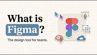
What Is Figma? A Beginner Guide for UI/UX Designers
What Figma is and why it is widely used in UI/UX design. The article expands the video into a structured English reference for product, UI, and UX.
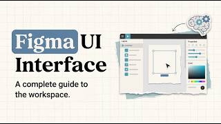
Figma Interface Overview: Workspace, Tools, and Panels
The Figma interface and give a complete overview of the Figma workspace for beginners. The article expands the video into a structured English reference for product, UI, and UX.
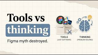
Knowing Figma Is Not Enough: The UX Designer Mindset
The difference between tools and thinking in UI/UX design and break the common myth that mastering Figma alone makes someone a great designer. The article expands the video into a structured English reference for product, UI, and UX.
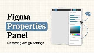
Figma Properties Panel: How to Read and Use It
The Figma Properties Panel (Properties Pane) and how to use it effectively while designing UI screens. The article expands the video into a structured English reference for product, UI, and UX.
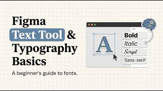
Figma Text Tool Basics: Typography Settings for Beginners
The basics of the Text Tool in Figma and how to properly use typography settings while designing UI screens. The article expands the video into a structured English reference for product, UI, and UX.
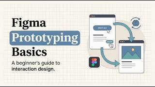
Figma Prototyping Basics: Creating Interactive Flows
The basics of prototyping in Figma and how to turn static designs into interactive user flows. The article expands the video into a structured English reference for product, UI, and UX.

Tinder UX Analysis: Simple Interactions and Engagement
Tinder from a UX perspective and explain how its simple interaction model drives high engagement and user retention. The article expands the video into a structured English reference for product, UI, and UX.

Instagram UX Analysis: Feeds, Stories, and Engagement Loops
Instagram from a UX perspective and explain how its design decisions drive engagement, retention, and daily usage. The article expands the video into a structured English reference for product, UI, and UX.

YouTube UX Analysis: Watch Time, Recommendations, and Flow
YouTube from a UX perspective and explain how its design decisions increase watch time, engagement, and content discovery. The article expands the video into a structured English reference for product, UI, and UX.

Google Search Suggestions: Autocomplete and UX Psychology
How Google Search Suggestions (Autocomplete) work from a UX perspective and why they are a powerful example of smart user experience design. The article expands the video into a structured English reference for product, UI, and UX.

Amazon App UX Analysis: Trust, Discovery, and Conversion
Amazon from a UX perspective and explain how its design decisions influence user behavior, trust, and purchasing decisions. The article expands the video into a structured English reference for product, UI, and UX.

Netflix UX Analysis: Personalization and Continuous Watching
Netflix from a UX perspective and explain how its design decisions increase engagement, retention, and binge-watching behavior. The article expands the video into a structured English reference for product, UI, and UX.
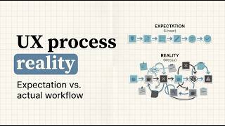
UX Process Reality: How UX Works in Real Projects
The real UX process and how it actually works in real-world projects, not just in textbooks or case studies. The article expands the video into a structured English reference for product, UI, and UX.
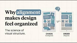
Alignment in UX: Why Organized Screens Feel Easier
Why alignment makes design feel organized and how proper alignment improves clarity, structure, and usability in apps and websites. The article expands the video into a structured English reference for product, UI, and UX.
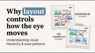
Layout Psychology: How Screens Guide the Eye
Why layout controls how the eye moves and how layout decisions directly influence user attention, clarity, and behavior in apps and websites. The article expands the video into a structured English reference for product, UI, and UX.
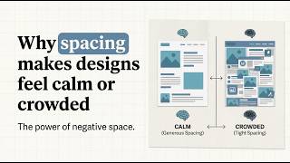
Spacing in UX: Calm, Crowded, and Clear Interfaces
Why spacing plays a critical role in making designs feel calm, clear, or crowded. The article expands the video into a structured English reference for product, UI, and UX.
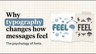
Typography Psychology: How Type Changes Meaning
Why typography changes how messages feel and how font choices influence perception, emotion, and trust in apps and websites. The article expands the video into a structured English reference for product, UI, and UX.
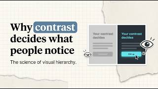
Contrast and Visual Hierarchy: What Users Notice First
Why contrast determines what people notice first in apps and websites, and how it directly influences attention, clarity, and usability. The article expands the video into a structured English reference for product, UI, and UX.
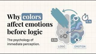
Color Psychology in UX: Emotion Before Logic
Why colors influence emotions before logic and how color psychology plays a powerful role in UI and UX design. The article expands the video into a structured English reference for product, UI, and UX.
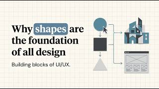
Shapes in Design: The Foundation of Every Interface
Why shapes are considered the foundation of all design and how every digital interface is built using basic geometric forms. The article expands the video into a structured English reference for product, UI, and UX.
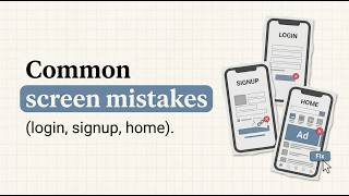
Common Screen Mistakes: Login, Signup, and Home UX Errors
The most common screen design mistakes found in login, signup, and home screens, and how these errors negatively impact user experience and conversions. The article expands the video into a structured English reference for product, UI, and UX.
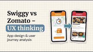
Swiggy vs Zomato UX Case Study: Comparing Real App Decisions
Swiggy vs Zomato from a UX thinking perspective using a practical, case-style approach without slide overload. The article expands the video into a structured English reference for product, UI, and UX.

Business and UX: Why Companies Invest in User Experience
Why companies invest in User Experience (UX) and how UX directly impacts revenue, growth, and customer retention. The article expands the video into a structured English reference for product, UI, and UX.
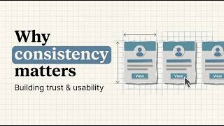
Consistency in UX: Why Repeated Patterns Build Trust
Why consistency is critical in apps and websites and how inconsistent design increases confusion, errors, and frustration for users. The article expands the video into a structured English reference for product, UI, and UX.
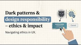
Dark Patterns and Design Responsibility: Ethics in UX
Dark patterns in UX design, their ethical impact, and the responsibility designers have when building digital products. The article expands the video into a structured English reference for product, UI, and UX.
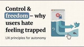
User Control and Freedom: Why Apps Need Clear Exit Paths
Why users need control and freedom while using apps and websites, and how lack of control creates frustration and fear. The article expands the video into a structured English reference for product, UI, and UX.
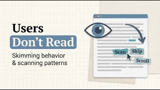
Users Do Not Read: Designing for Scanning Behavior
Why users don't read, how people actually consume digital content, and what this means for UI and UX design. The article expands the video into a structured English reference for product, UI, and UX.
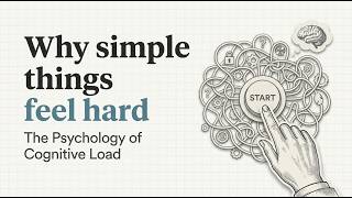
Why Simple Tasks Feel Hard: UX Friction Explained
Why users struggle with tasks that should feel simple, especially in apps and websites. The article expands the video into a structured English reference for product, UI, and UX.
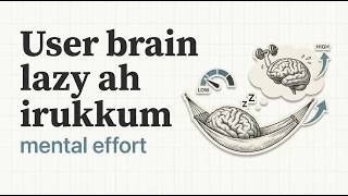
The Lazy Brain in UX: Designing for Low-Effort Decisions
Why the human brain prefers the easiest path and how this behavior directly affects how people use apps and websites. The article expands the video into a structured English reference for product, UI, and UX.
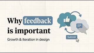
Feedback and Status Clarity: Why Users Need Immediate Response
Why users need clear feedback and status visibility while using apps and websites, and how lack of feedback creates anxiety and confusion. The article expands the video into a structured English reference for product, UI, and UX.
Designing Tamil-First Interfaces for Global Products
Designing Tamil-First Interfaces for Global Products is a long-form Tamil Design System article for global teams building Tamil-first or bilingual products. It explains practical UX decisions, Tamil-context behavior, accessibility checks, implementation guidance, and production-ready review criteria.
Tamil Typography for Product Screens
Tamil Typography for Product Screens is a long-form Tamil Design System article for global teams building Tamil-first or bilingual products. It explains practical UX decisions, Tamil-context behavior, accessibility checks, implementation guidance, and production-ready review criteria.
Bilingual UI Patterns for Tamil and English Products
Bilingual UI Patterns for Tamil and English Products is a long-form Tamil Design System article for global teams building Tamil-first or bilingual products. It explains practical UX decisions, Tamil-context behavior, accessibility checks, implementation guidance, and production-ready review criteria.
Tamil Form Design for Real Government and Service Workflows
Tamil Form Design for Real Government and Service Workflows is a long-form Tamil Design System article for global teams building Tamil-first or bilingual products. It explains practical UX decisions, Tamil-context behavior, accessibility checks, implementation guidance, and production-ready review criteria.
Building Search That Works With Tamil Spelling Variations
Building Search That Works With Tamil Spelling Variations is a long-form Tamil Design System article for global teams building Tamil-first or bilingual products. It explains practical UX decisions, Tamil-context behavior, accessibility checks, implementation guidance, and production-ready review criteria.
Tamil Error Messages That Help Users Recover
Tamil Error Messages That Help Users Recover is a long-form Tamil Design System article for global teams building Tamil-first or bilingual products. It explains practical UX decisions, Tamil-context behavior, accessibility checks, implementation guidance, and production-ready review criteria.
Tamil Navigation Labels and Information Architecture
Tamil Navigation Labels and Information Architecture is a long-form Tamil Design System article for global teams building Tamil-first or bilingual products. It explains practical UX decisions, Tamil-context behavior, accessibility checks, implementation guidance, and production-ready review criteria.
Designing Content for First-Time Tamil Internet Users
Designing Content for First-Time Tamil Internet Users is a long-form Tamil Design System article for global teams building Tamil-first or bilingual products. It explains practical UX decisions, Tamil-context behavior, accessibility checks, implementation guidance, and production-ready review criteria.
Localization QA Checklist for Tamil Digital Products
Localization QA Checklist for Tamil Digital Products is a long-form Tamil Design System article for global teams building Tamil-first or bilingual products. It explains practical UX decisions, Tamil-context behavior, accessibility checks, implementation guidance, and production-ready review criteria.
Tamil Microcopy Patterns for Trust and Clarity
Tamil Microcopy Patterns for Trust and Clarity is a long-form Tamil Design System article for global teams building Tamil-first or bilingual products. It explains practical UX decisions, Tamil-context behavior, accessibility checks, implementation guidance, and production-ready review criteria.
Design Systems for Public-Service Products
Design Systems for Public-Service Products is a long-form Tamil Design System article for design, engineering, and product teams scaling consistent UI across many services. It explains practical UX decisions, Tamil-context behavior, accessibility checks, implementation guidance, and production-ready review criteria.
How to Document Components So Teams Actually Use Them
How to Document Components So Teams Actually Use Them is a long-form Tamil Design System article for design, engineering, and product teams scaling consistent UI across many services. It explains practical UX decisions, Tamil-context behavior, accessibility checks, implementation guidance, and production-ready review criteria.
Token Strategy for Multilingual Interfaces
Token Strategy for Multilingual Interfaces is a long-form Tamil Design System article for design, engineering, and product teams scaling consistent UI across many services. It explains practical UX decisions, Tamil-context behavior, accessibility checks, implementation guidance, and production-ready review criteria.
Scaling a Design System Across Mobile Web and Kiosks
Scaling a Design System Across Mobile Web and Kiosks is a long-form Tamil Design System article for design, engineering, and product teams scaling consistent UI across many services. It explains practical UX decisions, Tamil-context behavior, accessibility checks, implementation guidance, and production-ready review criteria.
Governance for Tamil Design System Adoption
Governance for Tamil Design System Adoption is a long-form Tamil Design System article for design, engineering, and product teams scaling consistent UI across many services. It explains practical UX decisions, Tamil-context behavior, accessibility checks, implementation guidance, and production-ready review criteria.
Designing Component APIs for Localization
Designing Component APIs for Localization is a long-form Tamil Design System article for design, engineering, and product teams scaling consistent UI across many services. It explains practical UX decisions, Tamil-context behavior, accessibility checks, implementation guidance, and production-ready review criteria.
Accessibility as a Design System Requirement
Accessibility as a Design System Requirement is a long-form Tamil Design System article for design, engineering, and product teams scaling consistent UI across many services. It explains practical UX decisions, Tamil-context behavior, accessibility checks, implementation guidance, and production-ready review criteria.
How to Build Pattern Libraries From Real Workflows
How to Build Pattern Libraries From Real Workflows is a long-form Tamil Design System article for design, engineering, and product teams scaling consistent UI across many services. It explains practical UX decisions, Tamil-context behavior, accessibility checks, implementation guidance, and production-ready review criteria.
Design System Metrics That Matter
Design System Metrics That Matter is a long-form Tamil Design System article for design, engineering, and product teams scaling consistent UI across many services. It explains practical UX decisions, Tamil-context behavior, accessibility checks, implementation guidance, and production-ready review criteria.
Reducing Product Debt With Reusable UX Decisions
Reducing Product Debt With Reusable UX Decisions is a long-form Tamil Design System article for design, engineering, and product teams scaling consistent UI across many services. It explains practical UX decisions, Tamil-context behavior, accessibility checks, implementation guidance, and production-ready review criteria.
Accessible Forms for Tamil and English Users
Accessible Forms for Tamil and English Users is a long-form Tamil Design System article for teams building inclusive products for vision, hearing, motor, cognitive, and language needs. It explains practical UX decisions, Tamil-context behavior, accessibility checks, implementation guidance, and production-ready review criteria.
Screen Reader Friendly Tamil Content
Screen Reader Friendly Tamil Content is a long-form Tamil Design System article for teams building inclusive products for vision, hearing, motor, cognitive, and language needs. It explains practical UX decisions, Tamil-context behavior, accessibility checks, implementation guidance, and production-ready review criteria.
Keyboard Navigation in Complex Dashboards
Keyboard Navigation in Complex Dashboards is a long-form Tamil Design System article for teams building inclusive products for vision, hearing, motor, cognitive, and language needs. It explains practical UX decisions, Tamil-context behavior, accessibility checks, implementation guidance, and production-ready review criteria.
High Contrast UI for Outdoor Public-Service Use
High Contrast UI for Outdoor Public-Service Use is a long-form Tamil Design System article for teams building inclusive products for vision, hearing, motor, cognitive, and language needs. It explains practical UX decisions, Tamil-context behavior, accessibility checks, implementation guidance, and production-ready review criteria.
Designing for Older Adults in Tamil Nadu
Designing for Older Adults in Tamil Nadu is a long-form Tamil Design System article for teams building inclusive products for vision, hearing, motor, cognitive, and language needs. It explains practical UX decisions, Tamil-context behavior, accessibility checks, implementation guidance, and production-ready review criteria.
Error Recovery for Assistive Technology Users
Error Recovery for Assistive Technology Users is a long-form Tamil Design System article for teams building inclusive products for vision, hearing, motor, cognitive, and language needs. It explains practical UX decisions, Tamil-context behavior, accessibility checks, implementation guidance, and production-ready review criteria.
Accessible Data Tables for Government Services
Accessible Data Tables for Government Services is a long-form Tamil Design System article for teams building inclusive products for vision, hearing, motor, cognitive, and language needs. It explains practical UX decisions, Tamil-context behavior, accessibility checks, implementation guidance, and production-ready review criteria.
Designing Notifications for All Senses
Designing Notifications for All Senses is a long-form Tamil Design System article for teams building inclusive products for vision, hearing, motor, cognitive, and language needs. It explains practical UX decisions, Tamil-context behavior, accessibility checks, implementation guidance, and production-ready review criteria.
Inclusive Authentication and OTP Flows
Inclusive Authentication and OTP Flows is a long-form Tamil Design System article for teams building inclusive products for vision, hearing, motor, cognitive, and language needs. It explains practical UX decisions, Tamil-context behavior, accessibility checks, implementation guidance, and production-ready review criteria.
Accessibility QA for React Design Systems
Accessibility QA for React Design Systems is a long-form Tamil Design System article for teams building inclusive products for vision, hearing, motor, cognitive, and language needs. It explains practical UX decisions, Tamil-context behavior, accessibility checks, implementation guidance, and production-ready review criteria.
Designing Government Forms People Can Finish
Designing Government Forms People Can Finish is a long-form Tamil Design System article for teams designing citizen services, government portals, civic dashboards, and support flows. It explains practical UX decisions, Tamil-context behavior, accessibility checks, implementation guidance, and production-ready review criteria.
Certificate Application UX Checklist
Certificate Application UX Checklist is a long-form Tamil Design System article for teams designing citizen services, government portals, civic dashboards, and support flows. It explains practical UX decisions, Tamil-context behavior, accessibility checks, implementation guidance, and production-ready review criteria.
Ration Shop Service UX Patterns
Ration Shop Service UX Patterns is a long-form Tamil Design System article for teams designing citizen services, government portals, civic dashboards, and support flows. It explains practical UX decisions, Tamil-context behavior, accessibility checks, implementation guidance, and production-ready review criteria.
Public Dashboard UX for Trust and Transparency
Public Dashboard UX for Trust and Transparency is a long-form Tamil Design System article for teams designing citizen services, government portals, civic dashboards, and support flows. It explains practical UX decisions, Tamil-context behavior, accessibility checks, implementation guidance, and production-ready review criteria.
Designing Appointment Booking for Everyone
Designing Appointment Booking for Everyone is a long-form Tamil Design System article for teams designing citizen services, government portals, civic dashboards, and support flows. It explains practical UX decisions, Tamil-context behavior, accessibility checks, implementation guidance, and production-ready review criteria.
Document Upload UX for Low-Bandwidth Users
Document Upload UX for Low-Bandwidth Users is a long-form Tamil Design System article for teams designing citizen services, government portals, civic dashboards, and support flows. It explains practical UX decisions, Tamil-context behavior, accessibility checks, implementation guidance, and production-ready review criteria.
Status Tracking UX for Citizen Services
Status Tracking UX for Citizen Services is a long-form Tamil Design System article for teams designing citizen services, government portals, civic dashboards, and support flows. It explains practical UX decisions, Tamil-context behavior, accessibility checks, implementation guidance, and production-ready review criteria.
Consent and Privacy UX for Public Data
Consent and Privacy UX for Public Data is a long-form Tamil Design System article for teams designing citizen services, government portals, civic dashboards, and support flows. It explains practical UX decisions, Tamil-context behavior, accessibility checks, implementation guidance, and production-ready review criteria.
Help and Support UX for Government Websites
Help and Support UX for Government Websites is a long-form Tamil Design System article for teams designing citizen services, government portals, civic dashboards, and support flows. It explains practical UX decisions, Tamil-context behavior, accessibility checks, implementation guidance, and production-ready review criteria.
Service Journey Mapping for Tamil Nadu Products
Service Journey Mapping for Tamil Nadu Products is a long-form Tamil Design System article for teams designing citizen services, government portals, civic dashboards, and support flows. It explains practical UX decisions, Tamil-context behavior, accessibility checks, implementation guidance, and production-ready review criteria.
Mobile First Does Not Mean Mobile Only
Mobile First Does Not Mean Mobile Only is a long-form Tamil Design System article for teams shipping mobile-first products for mixed device quality, bandwidth, and language needs. It explains practical UX decisions, Tamil-context behavior, accessibility checks, implementation guidance, and production-ready review criteria.
Thumb-Friendly Tamil Interfaces
Thumb-Friendly Tamil Interfaces is a long-form Tamil Design System article for teams shipping mobile-first products for mixed device quality, bandwidth, and language needs. It explains practical UX decisions, Tamil-context behavior, accessibility checks, implementation guidance, and production-ready review criteria.
Low Bandwidth UX Patterns
Low Bandwidth UX Patterns is a long-form Tamil Design System article for teams shipping mobile-first products for mixed device quality, bandwidth, and language needs. It explains practical UX decisions, Tamil-context behavior, accessibility checks, implementation guidance, and production-ready review criteria.
Offline and Retry UX for Public Services
Offline and Retry UX for Public Services is a long-form Tamil Design System article for teams shipping mobile-first products for mixed device quality, bandwidth, and language needs. It explains practical UX decisions, Tamil-context behavior, accessibility checks, implementation guidance, and production-ready review criteria.
Responsive Cards Without Clipped Tamil Text
Responsive Cards Without Clipped Tamil Text is a long-form Tamil Design System article for teams shipping mobile-first products for mixed device quality, bandwidth, and language needs. It explains practical UX decisions, Tamil-context behavior, accessibility checks, implementation guidance, and production-ready review criteria.
Bottom Navigation for Tamil Apps
Bottom Navigation for Tamil Apps is a long-form Tamil Design System article for teams shipping mobile-first products for mixed device quality, bandwidth, and language needs. It explains practical UX decisions, Tamil-context behavior, accessibility checks, implementation guidance, and production-ready review criteria.
Mobile Form Validation That Feels Fair
Mobile Form Validation That Feels Fair is a long-form Tamil Design System article for teams shipping mobile-first products for mixed device quality, bandwidth, and language needs. It explains practical UX decisions, Tamil-context behavior, accessibility checks, implementation guidance, and production-ready review criteria.
Designing Touch Targets for Dense Screens
Designing Touch Targets for Dense Screens is a long-form Tamil Design System article for teams shipping mobile-first products for mixed device quality, bandwidth, and language needs. It explains practical UX decisions, Tamil-context behavior, accessibility checks, implementation guidance, and production-ready review criteria.
Search and Filter UX on Small Screens
Search and Filter UX on Small Screens is a long-form Tamil Design System article for teams shipping mobile-first products for mixed device quality, bandwidth, and language needs. It explains practical UX decisions, Tamil-context behavior, accessibility checks, implementation guidance, and production-ready review criteria.
Mobile Accessibility Testing Checklist
Mobile Accessibility Testing Checklist is a long-form Tamil Design System article for teams shipping mobile-first products for mixed device quality, bandwidth, and language needs. It explains practical UX decisions, Tamil-context behavior, accessibility checks, implementation guidance, and production-ready review criteria.
Why Users Scan Before They Read
Why Users Scan Before They Read is a long-form Tamil Design System article for designers and product teams who want practical behavior principles for everyday screens. It explains practical UX decisions, Tamil-context behavior, accessibility checks, implementation guidance, and production-ready review criteria.
Cognitive Load in Everyday Product Screens
Cognitive Load in Everyday Product Screens is a long-form Tamil Design System article for designers and product teams who want practical behavior principles for everyday screens. It explains practical UX decisions, Tamil-context behavior, accessibility checks, implementation guidance, and production-ready review criteria.
Trust Signals in Interface Design
Trust Signals in Interface Design is a long-form Tamil Design System article for designers and product teams who want practical behavior principles for everyday screens. It explains practical UX decisions, Tamil-context behavior, accessibility checks, implementation guidance, and production-ready review criteria.
Feedback Loops That Keep Users Confident
Feedback Loops That Keep Users Confident is a long-form Tamil Design System article for designers and product teams who want practical behavior principles for everyday screens. It explains practical UX decisions, Tamil-context behavior, accessibility checks, implementation guidance, and production-ready review criteria.
Recognition Over Recall in Tamil UX
Recognition Over Recall in Tamil UX is a long-form Tamil Design System article for designers and product teams who want practical behavior principles for everyday screens. It explains practical UX decisions, Tamil-context behavior, accessibility checks, implementation guidance, and production-ready review criteria.
Progressive Disclosure Without Hiding Critical Content
Progressive Disclosure Without Hiding Critical Content is a long-form Tamil Design System article for designers and product teams who want practical behavior principles for everyday screens. It explains practical UX decisions, Tamil-context behavior, accessibility checks, implementation guidance, and production-ready review criteria.
Empty States That Guide Action
Empty States That Guide Action is a long-form Tamil Design System article for designers and product teams who want practical behavior principles for everyday screens. It explains practical UX decisions, Tamil-context behavior, accessibility checks, implementation guidance, and production-ready review criteria.
Decision Fatigue in Form Design
Decision Fatigue in Form Design is a long-form Tamil Design System article for designers and product teams who want practical behavior principles for everyday screens. It explains practical UX decisions, Tamil-context behavior, accessibility checks, implementation guidance, and production-ready review criteria.
Visual Hierarchy for Public-Service Screens
Visual Hierarchy for Public-Service Screens is a long-form Tamil Design System article for designers and product teams who want practical behavior principles for everyday screens. It explains practical UX decisions, Tamil-context behavior, accessibility checks, implementation guidance, and production-ready review criteria.
Designing Calm Interfaces for Stressful Tasks
Designing Calm Interfaces for Stressful Tasks is a long-form Tamil Design System article for designers and product teams who want practical behavior principles for everyday screens. It explains practical UX decisions, Tamil-context behavior, accessibility checks, implementation guidance, and production-ready review criteria.
AI Interfaces for Tamil Users
AI Interfaces for Tamil Users is a long-form Tamil Design System article for teams adding AI assistants, generated content, or intelligent workflows to product experiences. It explains practical UX decisions, Tamil-context behavior, accessibility checks, implementation guidance, and production-ready review criteria.
Prompt UX for Public-Service Assistants
Prompt UX for Public-Service Assistants is a long-form Tamil Design System article for teams adding AI assistants, generated content, or intelligent workflows to product experiences. It explains practical UX decisions, Tamil-context behavior, accessibility checks, implementation guidance, and production-ready review criteria.
Designing AI Chat With Trust and Safety
Designing AI Chat With Trust and Safety is a long-form Tamil Design System article for teams adding AI assistants, generated content, or intelligent workflows to product experiences. It explains practical UX decisions, Tamil-context behavior, accessibility checks, implementation guidance, and production-ready review criteria.
Human Handoff in AI Service Flows
Human Handoff in AI Service Flows is a long-form Tamil Design System article for teams adding AI assistants, generated content, or intelligent workflows to product experiences. It explains practical UX decisions, Tamil-context behavior, accessibility checks, implementation guidance, and production-ready review criteria.
AI Disclosure Patterns Users Understand
AI Disclosure Patterns Users Understand is a long-form Tamil Design System article for teams adding AI assistants, generated content, or intelligent workflows to product experiences. It explains practical UX decisions, Tamil-context behavior, accessibility checks, implementation guidance, and production-ready review criteria.
Multilingual AI Responses and Error Recovery
Multilingual AI Responses and Error Recovery is a long-form Tamil Design System article for teams adding AI assistants, generated content, or intelligent workflows to product experiences. It explains practical UX decisions, Tamil-context behavior, accessibility checks, implementation guidance, and production-ready review criteria.
AI Generated Design Review Checklist
AI Generated Design Review Checklist is a long-form Tamil Design System article for teams adding AI assistants, generated content, or intelligent workflows to product experiences. It explains practical UX decisions, Tamil-context behavior, accessibility checks, implementation guidance, and production-ready review criteria.
Data Privacy UX for AI Tools
Data Privacy UX for AI Tools is a long-form Tamil Design System article for teams adding AI assistants, generated content, or intelligent workflows to product experiences. It explains practical UX decisions, Tamil-context behavior, accessibility checks, implementation guidance, and production-ready review criteria.
Designing Feedback for AI Uncertainty
Designing Feedback for AI Uncertainty is a long-form Tamil Design System article for teams adding AI assistants, generated content, or intelligent workflows to product experiences. It explains practical UX decisions, Tamil-context behavior, accessibility checks, implementation guidance, and production-ready review criteria.
Kural AI Experience Principles
Kural AI Experience Principles is a long-form Tamil Design System article for teams adding AI assistants, generated content, or intelligent workflows to product experiences. It explains practical UX decisions, Tamil-context behavior, accessibility checks, implementation guidance, and production-ready review criteria.
Conducting UX Research With Tamil-Speaking Users
Conducting UX Research With Tamil-Speaking Users is a long-form Tamil Design System article for researchers, designers, founders, and students learning from Tamil-speaking users. It explains practical UX decisions, Tamil-context behavior, accessibility checks, implementation guidance, and production-ready review criteria.
Interview Questions for Public-Service UX
Interview Questions for Public-Service UX is a long-form Tamil Design System article for researchers, designers, founders, and students learning from Tamil-speaking users. It explains practical UX decisions, Tamil-context behavior, accessibility checks, implementation guidance, and production-ready review criteria.
Usability Testing Bilingual Interfaces
Usability Testing Bilingual Interfaces is a long-form Tamil Design System article for researchers, designers, founders, and students learning from Tamil-speaking users. It explains practical UX decisions, Tamil-context behavior, accessibility checks, implementation guidance, and production-ready review criteria.
Turning Research Notes Into Design Decisions
Turning Research Notes Into Design Decisions is a long-form Tamil Design System article for researchers, designers, founders, and students learning from Tamil-speaking users. It explains practical UX decisions, Tamil-context behavior, accessibility checks, implementation guidance, and production-ready review criteria.
Writing UX Case Studies With Evidence
Writing UX Case Studies With Evidence is a long-form Tamil Design System article for researchers, designers, founders, and students learning from Tamil-speaking users. It explains practical UX decisions, Tamil-context behavior, accessibility checks, implementation guidance, and production-ready review criteria.
Content Design for Policy and Eligibility Pages
Content Design for Policy and Eligibility Pages is a long-form Tamil Design System article for researchers, designers, founders, and students learning from Tamil-speaking users. It explains practical UX decisions, Tamil-context behavior, accessibility checks, implementation guidance, and production-ready review criteria.
Plain Language for Complex Services
Plain Language for Complex Services is a long-form Tamil Design System article for researchers, designers, founders, and students learning from Tamil-speaking users. It explains practical UX decisions, Tamil-context behavior, accessibility checks, implementation guidance, and production-ready review criteria.
Measuring Comprehension in Tamil UX
Measuring Comprehension in Tamil UX is a long-form Tamil Design System article for researchers, designers, founders, and students learning from Tamil-speaking users. It explains practical UX decisions, Tamil-context behavior, accessibility checks, implementation guidance, and production-ready review criteria.
Designing FAQs That Actually Help
Designing FAQs That Actually Help is a long-form Tamil Design System article for researchers, designers, founders, and students learning from Tamil-speaking users. It explains practical UX decisions, Tamil-context behavior, accessibility checks, implementation guidance, and production-ready review criteria.
Building UX Research Repositories for Local Context
Building UX Research Repositories for Local Context is a long-form Tamil Design System article for researchers, designers, founders, and students learning from Tamil-speaking users. It explains practical UX decisions, Tamil-context behavior, accessibility checks, implementation guidance, and production-ready review criteria.
Choosing Between Dialog, Sheet, and Page
Choosing Between Dialog, Sheet, and Page is a long-form Tamil Design System article for teams choosing reusable interaction patterns for forms, dashboards, documents, and workflows. It explains practical UX decisions, Tamil-context behavior, accessibility checks, implementation guidance, and production-ready review criteria.
Button Hierarchy for High-Stakes Actions
Button Hierarchy for High-Stakes Actions is a long-form Tamil Design System article for teams choosing reusable interaction patterns for forms, dashboards, documents, and workflows. It explains practical UX decisions, Tamil-context behavior, accessibility checks, implementation guidance, and production-ready review criteria.
Table vs Card Layouts for Service Data
Table vs Card Layouts for Service Data is a long-form Tamil Design System article for teams choosing reusable interaction patterns for forms, dashboards, documents, and workflows. It explains practical UX decisions, Tamil-context behavior, accessibility checks, implementation guidance, and production-ready review criteria.
Filter Design for Complex Public Data
Filter Design for Complex Public Data is a long-form Tamil Design System article for teams choosing reusable interaction patterns for forms, dashboards, documents, and workflows. It explains practical UX decisions, Tamil-context behavior, accessibility checks, implementation guidance, and production-ready review criteria.
Alert Patterns for Risk and Recovery
Alert Patterns for Risk and Recovery is a long-form Tamil Design System article for teams choosing reusable interaction patterns for forms, dashboards, documents, and workflows. It explains practical UX decisions, Tamil-context behavior, accessibility checks, implementation guidance, and production-ready review criteria.
Stepper UX for Long Applications
Stepper UX for Long Applications is a long-form Tamil Design System article for teams choosing reusable interaction patterns for forms, dashboards, documents, and workflows. It explains practical UX decisions, Tamil-context behavior, accessibility checks, implementation guidance, and production-ready review criteria.
File Upload Components for Documents
File Upload Components for Documents is a long-form Tamil Design System article for teams choosing reusable interaction patterns for forms, dashboards, documents, and workflows. It explains practical UX decisions, Tamil-context behavior, accessibility checks, implementation guidance, and production-ready review criteria.
Language Switcher UX for Bilingual Products
Language Switcher UX for Bilingual Products is a long-form Tamil Design System article for teams choosing reusable interaction patterns for forms, dashboards, documents, and workflows. It explains practical UX decisions, Tamil-context behavior, accessibility checks, implementation guidance, and production-ready review criteria.
Form Summary and Review Pattern
Form Summary and Review Pattern is a long-form Tamil Design System article for teams choosing reusable interaction patterns for forms, dashboards, documents, and workflows. It explains practical UX decisions, Tamil-context behavior, accessibility checks, implementation guidance, and production-ready review criteria.
Dashboard Cards for Operational Teams
Dashboard Cards for Operational Teams is a long-form Tamil Design System article for teams choosing reusable interaction patterns for forms, dashboards, documents, and workflows. It explains practical UX decisions, Tamil-context behavior, accessibility checks, implementation guidance, and production-ready review criteria.
How Tamil Design System Helps Global Teams Build Locally
How Tamil Design System Helps Global Teams Build Locally is a long-form Tamil Design System article for global designers, Tamil creators, open-source contributors, educators, and product leaders. It explains practical UX decisions, Tamil-context behavior, accessibility checks, implementation guidance, and production-ready review criteria.
Open Source Design Systems for Regional Languages
Open Source Design Systems for Regional Languages is a long-form Tamil Design System article for global designers, Tamil creators, open-source contributors, educators, and product leaders. It explains practical UX decisions, Tamil-context behavior, accessibility checks, implementation guidance, and production-ready review criteria.
Building Design Education for Tamil UX Designers
Building Design Education for Tamil UX Designers is a long-form Tamil Design System article for global designers, Tamil creators, open-source contributors, educators, and product leaders. It explains practical UX decisions, Tamil-context behavior, accessibility checks, implementation guidance, and production-ready review criteria.
Community Contribution Model for Tamil DS
Community Contribution Model for Tamil DS is a long-form Tamil Design System article for global designers, Tamil creators, open-source contributors, educators, and product leaders. It explains practical UX decisions, Tamil-context behavior, accessibility checks, implementation guidance, and production-ready review criteria.
Making Design Documentation Discoverable
Making Design Documentation Discoverable is a long-form Tamil Design System article for global designers, Tamil creators, open-source contributors, educators, and product leaders. It explains practical UX decisions, Tamil-context behavior, accessibility checks, implementation guidance, and production-ready review criteria.
Designing Portfolio Projects With Tamil Context
Designing Portfolio Projects With Tamil Context is a long-form Tamil Design System article for global designers, Tamil creators, open-source contributors, educators, and product leaders. It explains practical UX decisions, Tamil-context behavior, accessibility checks, implementation guidance, and production-ready review criteria.
Teaching UI UX Through Real Tamil Products
Teaching UI UX Through Real Tamil Products is a long-form Tamil Design System article for global designers, Tamil creators, open-source contributors, educators, and product leaders. It explains practical UX decisions, Tamil-context behavior, accessibility checks, implementation guidance, and production-ready review criteria.
Why Regional Design Systems Matter Globally
Why Regional Design Systems Matter Globally is a long-form Tamil Design System article for global designers, Tamil creators, open-source contributors, educators, and product leaders. It explains practical UX decisions, Tamil-context behavior, accessibility checks, implementation guidance, and production-ready review criteria.
Inclusive Product Strategy for India and Beyond
Inclusive Product Strategy for India and Beyond is a long-form Tamil Design System article for global designers, Tamil creators, open-source contributors, educators, and product leaders. It explains practical UX decisions, Tamil-context behavior, accessibility checks, implementation guidance, and production-ready review criteria.
The Future of Tamil Digital Product Design
The Future of Tamil Digital Product Design is a long-form Tamil Design System article for global designers, Tamil creators, open-source contributors, educators, and product leaders. It explains practical UX decisions, Tamil-context behavior, accessibility checks, implementation guidance, and production-ready review criteria.